All projects

Redesigning a football management app to improve training efficiency and player engagement

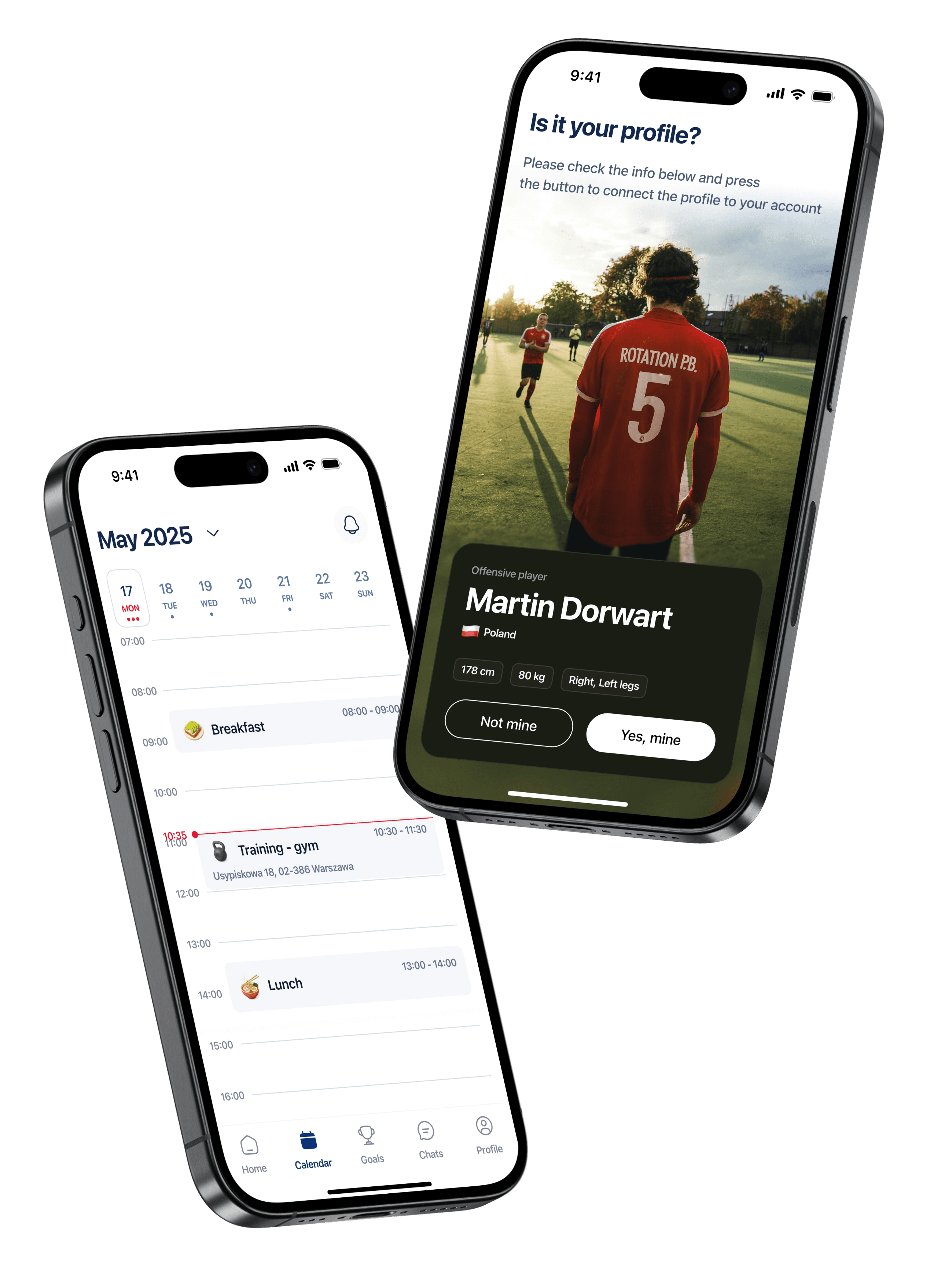
UnderSports helps football clubs and academies manage schedules, training sessions, and player well-being. However, players often missed sessions, struggled with confusing registration, and found the app’s calendar unhelpful

Role

Lead UX/UI Designer

Duration

8 months

01

Problems

Solutions

Lack of UX expertise in decision-making
The app was released quickly without design oversight or a system in place, leading to inconsistent patterns and usability gaps.

Research-driven redesign
Introduced structured UX practices and a unified design system, grounding decisions in user insights.


Outdated and cluttered design
Visuals were heavy, inconsistent, and difficult to scan, making everyday use frustrating.

Clean, modern, consistent UI
Applied a clean, modern UI with clear hierarchy, consistency, and improved readability.

Complicated and confusing registration
Onboarding involved too many steps, unclear errors, and frequent drop-offs.

Streamlined onboarding
Simplified registration with fewer steps, direct login links, and automatic language detection.

Calendar is uninformative and overloaded
The schedule was hard to interpret, with cluttered details and poor task differentiation.

Structured, easy-to-scan calendar
Redesigned the calendar with clearer structure, grouped activities, and intuitive visual cues to make schedules easy to scan at a glance.

Cumbersome wellness questionnaire
The survey was long, text-heavy, and difficult to scan, which discouraged players from completing it regularly.

Lightweight, user-friendly surveys
Redesigned the questionnaire with concise questions, clear formatting, and visual inputs, making it faster and more engaging to complete.

02

Research & Insights

Approach

I ran 3 in-depth interviews with active players, using a 40+ question guide focused on onboarding, scheduling, and wellness surveys. Each session was recorded and analyzed to validate assumptions.

Key Findings:

  • Players need instant schedule visibility → They want to see today’s plan at a glance without extra clicks.

  • Training details must be richer → Photos and videos of exercises are more helpful than plain text.

  • Feedback preferences differ by age → Teenagers rely on simple ratings, adults expect written input and stats.

  • Wellness survey felt too heavy → Long and text-dense, discouraging players from completing it regularly.

03

Research & Insights

When I started exploring the existing app, I noticed a pattern: players were frustrated not only with the look of the product, but with how much effort it took to use. Registration felt like a barrier, navigation was confusing, and the calendar was overloaded with details.

“The survey feels long, I don’t always want to fill it in.”

“It would be easier if I could just log in with Face ID.”

“Important actions are hidden. I wish the main stuff were right there at the bottom.”

“It would be great if the app reminded me about equipment before training.”

From these early observations and interviews, I generated over 40 hypotheses. To stay focused, I prioritized them using an Impact vs. Effort matrix, which allowed me to identify the most crucial issues first.


The three that became most critical were:

  1. Simplifying onboarding would reduce drop-offs and make it easier for new players to get started.

  2. Placing core actions up front would help players and coaches reach what they need in fewer taps.

  3. Refreshing the interface with a clean, consistent design would make the app feel lighter, easier, and more trustworthy.

I then tested these hypotheses step by step — starting with onboarding, then navigation, and finally calendar and wellness features — using quick prototypes and continuous feedback from real players and coaches.

04

Design Solutions

The redesign addressed the most critical pain points identified in research. Each solution was tested with players and coaches to ensure it solved the right problem.

Registration & Onboarding

Before: Too many steps, confusing flow, frequent drop-offs.

After: Streamlined flow with direct login links and automatic language detection, reducing friction for new users.

Navigation

Before: The app relied solely on a top navigation bar, with no bottom navigation. As a result, key actions were hidden behind menus and harder to access quickly.

After: Introduced a bottom navigation bar for primary sections, reducing steps and aligning with platform guidelines for faster, more intuitive navigation.

Calendar

Before: Events were unstructured and overloaded with details, making it difficult for players to quickly distinguish between them.

After: Introduced a structured daily view with grouped activities and clear visual cues, allowing players to scan and understand their schedule at a glance.

05

Results & Impact

Testing with players and coaches confirmed that the redesign significantly improved usability. Onboarding became smoother with fewer drop-offs, navigation was faster, and the calendar and wellness questionnaire were easier to use.
Even in prototype testing, players described the new design as lighter, easier, and more professional, showing strong validation before development.

06

Reflections

Through step-by-step validation, I discovered that even minor design changes — such as simplifying a form or reorganizing navigation — can have a significant impact on engagement. Most importantly, the process showed that listening to users early and often leads to designs that feel natural, not forced.

07

Next Steps

The redesigned UnderSports app is now moving from validated prototypes into development. My role concluded with tested and refined design handoffs, while the product team is continuing with:

  • Implementation & QA: building the redesigned onboarding, navigation, calendar, and surveys into production.

  • Beta testing with clubs: releasing to a small group of players and coaches to gather real-world data.

  • Iterating on engagement: measuring adoption of the new calendar and surveys, and refining based on usage patterns.

© 2025 Product designer

© 2025 Product designer

© 2025 Product designer

© 2025 Product designer

© 2025 Product designer

Create a free website with Framer, the website builder loved by startups, designers and agencies.